Half of my senior year is about to come to a close, ya'll. The goal for AP Studio is to have 12 breadth pieces done by this coming Wednesday. I think I'm going to use a couple of these for my concentration since my concentration deals with the intimate relationship with people and their personal environments, which is perfect for me. One, I'm still painting portraits of people which I'm most comfortable with, and two, I'm satisfying Sweeney by incorporating landscapes and perspectives and all that art crap.
As our midterm grade, we're critiquing each others' works on the last day before break. Here's what I got so far. Names are not official:
1. Merritt Portrait
2. Swine
3. Sad Onion
4. Girl by Pond
5. Truth
6. Concept Art - 3 characters
7. Fishing
8. Carrot Lady
9. Friendship
10. Ugly-ass shit. AKA weekend piece
* 11. Grant Wood
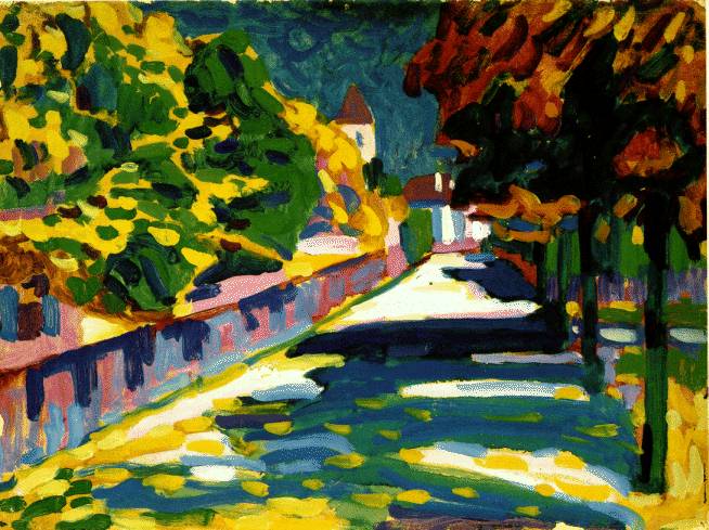
* 12. Summer's Wake
* = denotes work in progress
I think I'll make it.
P.S. Hayyy Park Hill South folks! Happy creepin'. Hahahahaha. Stay classy, PHS, stay classy.